Modern Furniture Paint Finish For Vintage Furniture
As an Amazon Associate, I earn from qualifying purchases.
Modern Furniture Paint Finish
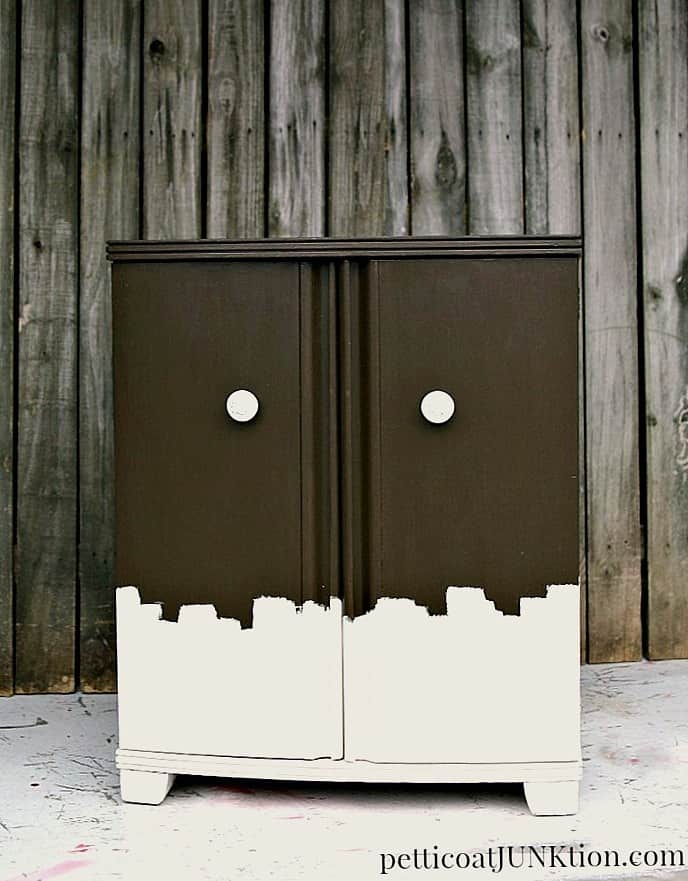
This Better Homes and Gardens inspired furniture makeover features a modern furniture paint finish. I went back and forth about trying this paint technique on the cabinet because it is a very unique look and definitely on the modern side.
I thought if I messed it up I would just repaint. I finally bit the bullet and did it. I’m glad I did. I haven’t done anything outside of the box in a while. I like it. It will not be everyone’s cup of tea but that’s okay.

Better Homes And Gardens Inspired
Today is Themed Furniture Makeover Day.This month’s theme is “Inspired by Chocolate”. Now that might sound like a narrow theme but remember…there is dark chocolate, white and milk chocolate, and tons of stencils or fabrics that feature chocolate.
My project plan was to paint my selected furniture piece milk chocolate and stencil a design on the front. It sounded like so many other projects I’ve done in the past but that’s what I was going with. Thank goodness inspiration struck mid project.

I don’t remember when or where I got this piece. Between me and the JTS neither of us could remember. Our memories aren’t what they used to be. I know it has to be from the flea market or my favorite junk shop but I couldn’t find a picture of it anywhere. That means I have no clue what I paid for it either. I do know it’s a vintage record cabinet.

The inside is a mess. I cleaned it up and may paint it white or just use some Howard’s Feed ‘n Wax on it. To be decided later. The outside is all done.

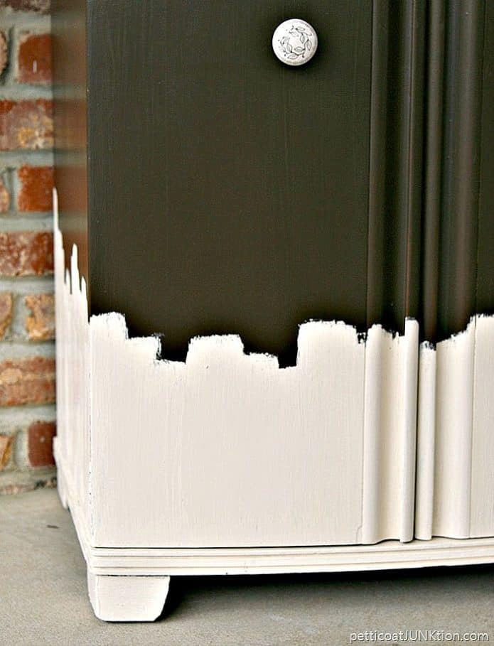
I painted it with latex paint from a prior home project and the color name is Expresso Beans. I decided not to do the stencil on the front but it needed something.

I found two furniture knobs in my stash that worked perfectly with the color. I drilled holes for the knobs. The cabinet looked better all ready. By this time I had found inspiration from the March edition of Better Homes and Gardens. The issue arrived in the mail while this project was in progress.

I was flipping through the magazine when the painted chairs caught my eye. Well, not all the chairs. The only one that caught my eye was the last one on the right. I fell in love with the look and tore the page out of the magazine for future reference. I know some of you are cringing right now. This is the first magazine I’ve done that to in a while. I see all this inspiration in the magazines then forget about the idea or can’t find where I saw it in the first place. I bet you guys have been there too.
Painted Furniture Inspired By Chocolate
The knobs are from Hobby Lobby and I used Reclaim paint in off-white for the accent color. Now remember this month’s theme is “Inspired by Chocolate” and I have milk chocolate and white chocolate represented in the makeover. Win-Win.
Modern Furniture Paint Finish For Vintage Furniture
What do you guys think? I value your opinion.
Video Tutorial of another Petticoat Junktion paint technique you might like…
Layered Paint Technique For Furniture
View my furniture project gallery by clicking here… Painted Furniture Gallery.
Time to see what my buddies have for us. Click those photos below to see the complete projects.
Have a great weekend!
Such a great mix of hate love. Your inspiration is so fun! You always have the greatest pieces of furniture!
What a difference! I love that it looks like a cityscape! Thank you for sharing with us at the #HomeMattersParty
You had me at chocolate, especially espresso! Love it! Thanks for sharing at Merry Monday. 🙂
This is wonderful! Pinning. What a great effect.
Kathy I love this look so much!! Such a modern take. Can’t wait to share!
ah thanks, you’re so sweet.
I always love seeing all you creative ladies come up with amazing pieces every month! This piece didn’t disappoint – I love the contrast of colors. It’s super cool!
This one really caught my eye and drew me in Kathy! Super cool and fun, makes me want to paint a bunny chocolate brown for an Easter vignette, adore this project very creative!
I do not like the two-toned paint. Not my style. Makes it look unfinished to me. Love the knobs.
I love that! Very creative. Might have to try that some time.
I thought the same thing as Paula@Sweet Pea, City Skyline. I like the idea and understand you had to work with the Chocolate theme. I would like to see the white skyline done in rose gold or just plain gold. The more I look at it the more I like it. Ty for sharing.
That’s exactly what I was thinking. The more I look at it the more I like it but I’m not brave enough to try and pull that off myself.
My first thought when I saw this piece was “city skyline”. I like how the white pops against the brown. This piece will be great for storage.
I love it! I think it has a very cool vibe–like something from Arhaus or a boutique.
Thank you Stacy!
This is one of the coolest pieces I’ve seen in a while. I am just loving the abstract two-tone look – I initially thought it was a skyline, but this is even better!
Thanks for the comment Arlo. You are exactly right!
I THINK IF THE WHITE HAD CHRISP EDGES IT WOULD LOOK LIKE A COOL CITYSCAPE. IT,S UNIQUE.
Susie, You are so sweet. Thank you. I think it’s going to find a home with me.I really like it and am thinking of replacing a piece in our den with the cabinet. Not sure if it will fit. I still need to paint the inside of the cabinet then we’ll see.
Kathy,
I love this piece. It’s unique and artistic. These are qualities I truly appreciate. If furniture is going to be refinished by hand, then it should have a quality of art as well as quality. You have both. I look forward to seeing where this piece will call home.
Great job.
XOXO
Susie
Wow, I really like this!
I love your fearless style! I agree with one of the others, I think it looks like a city skyline. Very cool piece Kathy!
Looks like you poured chocolate ganache over it! Love it!
Looks like a city skyline! Urban chic!
Sorry, I think it looks like someone walked off the job and didn’t finish painting. Great cabinet, but I do not like the paint job.
Love it!
I love your take on the chocolate theme, especially the “double dipping” with the white and dark chocolate win. So funny, I still have a file folder full of torn magazine pages from pre-pinterest days, it’s always fun to look back through them (and cringe at some of my inspiration!) ~Tami
Thanks Marie, I see ultra modern too. Seeing the piece in person is so different than looking at a photo. I always see this issue with photos of furniture.
It reminds me of those yummy black & white cookies from NYC! It’s such a unique cabinet, I’m glad you saved it!
Like your outside-of-the-box creativity Kathy and your courage to go for it! Some say cowboy, I see modern. I could see someone who loves unique, fresh, and modern pieces scooping this cabinet up. Pinning to share!
Like the paint, but not the knobs. I think if you change them it could really go cowboy country.
I love that you were fearless with this piece, Kathy! XO
Me too. Love the cabinet but not he paint.
Ticky, tacky…..love the cabinet but not the 2-toned paint…..
Such a unique idea, Kathy! I think it turned out really cool and it looks like it’s been dipped in chocolate. Love your creativity!
I REALLY LIKE THIS LOOK! IT LOOKS LIKE IT HAS A WESTERN THEME WHICH I REALLY LIKE…
I love it! It turned out really great!!!!
I love it! It’s fun and out-of-the-box thinking. Totally cool, Kathy!