Red White And Blue Furniture Makeover
As an Amazon Associate, I earn from qualifying purchases.
Hey guys! It’s themed furniture day and today’s theme is “Red, White, or Blue”. I’m not sure about my red white and blue furniture makeover. I’m waiting on your opinions.

I’m not sure about my project. It could be a love or hate… undecided on my end. It’s definitely not my favorite painted furniture project. I want your ideas and opinions please.
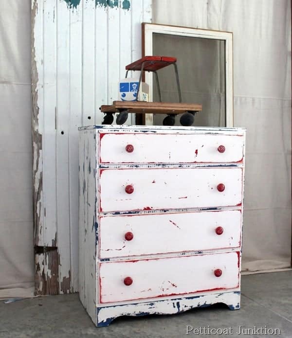
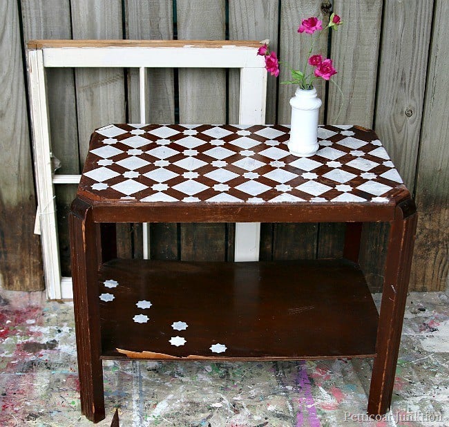
Instead of doing red, white, or blue I went for all three colors. My plan was to recreate or replicate this look. The red, white, and blue chest I bought at the Nashville Flea Market turned out beautifully.
The thing is…I didn’t paint it. I worked with what was there. If you would like to see how I totally transformed the chest without repainting you can view it here…Red, White, and Blue Furniture.

I bought the chest for today’s project on my last trip to the Nashville Flea Market. Miss Sofi photo bombed me. She was a little sickly on this day and was hanging out with mamaw and papaw.
Sofi asked if she could get in the photo and of course I said yes. She dragged one of her little chairs behind the chest and stood on it to pose.

The paint finish is a little over the top….too busy. I might put another coat of white paint on the chest and then distress lightly so there is less blue and red showing through. Or maybe I will just repaint the drawer pulls in the beautiful blue color?

Those are a couple of ideas anyway. What do you guys think about the chest? You can be honest. I don’t mind constructive criticism and I read all of your comments.
If you would like to know how I achieved this paint finish I will share it next week with the before, after, and in-between!
update: June 1, 2016 (or one week later) Well, I couldn’t stand it. So I worked on the dud.

I know most of you commented favorably on the Red White Blue Furniture Makeover Is A Dud post but the more I looked at the chest of drawers the more I hated it.

I still haven’t posted the layered paint project technique but I will next week. I hate to write a tutorial if the project doesn’t go well but I will on this one.
One of the problems was that the only white paint I had in my stock was a semi-gloss. I should have known better but I didn’t want to go to the store and get anything else.
I’m lazy…and cheap. So the semi-gloss was super shiny and it also was a little thick. The JTS and I had to go to Home Depot for something and I grabbed a can of flat white!! I’m really loving the flat finish for furniture.
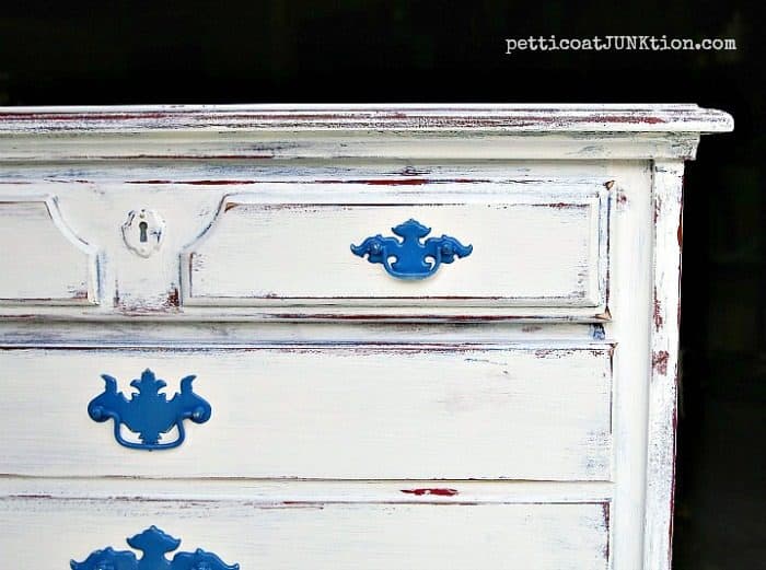
I also got a can of blue spray paint for the hardware. The blue happened to match the blue I used for the second layer of paint. How perfect is that.
like painting hardware. I don’t find it tacky at all. I do like to work with the original hardware and leave the finish as is when appropriate for the furniture makeover.

After I painted the whole thing again with flat white paint I distressed…….lightly!
How do you like it now? Better? Or did you like the first makeover? That’s it for me. Have a great day!
Now it’s time to see what the other girls have today. Just click the photos below to view the complete project.
Have a great day and I’ll see you next week… on Tuesday. Kathy


Sorry this comment is late. I’d say this is not your greatest achievement. Another coat of white would be the way to go
Love Love lOVE
I laughed when I opened your email and saw ‘dud’! HA! I kinda like it….maybe you could take the hardware off and stress them out a bit….I don’t know.
I love the colors poking through! The chippy goodness is gorgeous!
Kathy, I love it when you layer your paint like that and especially how the red and blue peek through. So fun!
~Tami
I do like the first one you found better. I am not a big fan of the distressing on the flat surfaces but for the right person this might be the perfect piece. I do think I would like it more if the pulls were blue as you mentioned. I have found that the pieces that I don’t love are ones that sell quickest though . . . 😀
I do love your work, but this is not my favorite? It’s close, maybe a white drawer front a blue and red drawer fronts from magnolia paint, not conventional blue and red????? What do I know!
Not a DUD at all! I love the colors popping through!
I love it!
Hugs,
Karin
I love this piece because you are using my favorite colors. Got to love red.
Not loving it. Maybe do something with the drawer pulls.
Hey, Kathy, I love your piece and don’t think I’d change anything! Good work!
I totally like it the way it is. Typically I don’t like the bright red white & blue Americana look, but this isn’t that and I love it!
I think the dresser looks fine! I love the multiple-color undercoats—I do this often with the pieces that I restore.
I think I would paint another coat and lightly distress it – that’s just my preference. But what I first noticed was the handles didn’t show up. I’m not sure about painting them – maybe just sanding them so they have some definition? That might be enough to make the chest look more like what you had in mind.
Honestly Kathy, it’s totally not my style, but I REALLY like it. I’m not sure what it is, but I think it’s really interesting and cool. A pop of color on the pulls would be nice, although I’m not sure what color. Otherwise, though, I really do think it’s awesome. And hats off to you for sharing a piece that you weren’t totally sure about with us – most people wouldn’t have the courage to be so candid 🙂
I can’t call it a dud, but you’ve done way better. There is definitely too much of something going on. Don’t quite know what.
I think maybe another coat of white with a bit more distressing… I do love the red pulls on the other dresser, so a fun pop of color on these pulls might be fun too!
You always do great work, but I would like it better with just the red showing through. Remember, it is only paint and you always need something else to paint!
Definitely not a dud, Kathy. I wouldn’t expect anything less than something wonderfully unique and with loads of chippy goodness from you. Looking at the picture, I think you’re onto something by painting the batwing pulls blue, muted with white wax or something. Or what about red and blue muted pulls?
I would do something to the hardware. Not brass, don’t like brass.
I love it as is and wouldn’t change a thing! It is beautiful!
These pieces are beautiful. I was expecting stars and stripes. I think you did a wonderful job and I intend to copy it too. Thank for sharing.
I now see the entire piece finished at top of page; I don’t know why it was not showing up on my page before. I love it.
Absolutely darlin’ – am gonna go find that paint and redo my sewing cabinet! Good job!
LOVE IT!!!! I think you did a great job and I LOVE the red, white and blue colors, just enough and not “in your face”. Have a great day and love your blog.
I like it, it’s very charming. I’m going to try to recreate it with an old fashioned grey & a rust color. If I get it finished soon I’ll try to post the pix.
My first thought was way too munch distressing. Looks like it needs one more coat of white and just light distressing. Don’t like the white drawer pulls either. Anything you come up with would look better.
I would like to see picture of the entire piece finished. I like what I see. But I agree with others that the hardware needs to stand out more. I wonder if dry brushing it blue or red would work as I don’t think it would look right if solid blue- it is too large for that, in my opinion.
I think it looks great! I love your blog and your honesty about your projects. Keep up the good work and thanks for letting us enjoy your passion with you ??
The first thing I noticed was that the hardware didn’t show up at all. I wasn’t thinking blue, but when you said it, I was like hummmmmm. Might work. I think that might give it more character.
I would do another coat and lightly distress. And sand the hardware. But I like it!
Definitely NOT a dud. I do think the hardware needs to be different to stand out just a little bit. What a fun piece!
Toooooo much distressing. Needs to be more one color and glazed. Cleaned and polished hardware. Tacky to paint hardware to match body of furniture…..sorry, but, just my opinion…..
It looks great! I like the red, white, and blue and think in the right room it would look perfect.
I love it as is. I agree that a little color on the pulls may do the trick for you since they really pop on the original. Love the colors peeking through! 🙂
Oh think your idea of redoing the drawers to add more red would look good!?
Kathy, this turned out so great! I LOVE IT!
A dud? Are you kidding me? I LOVE it! It’s great..feel free to send that gorgeous dresser my way…LOL. I like your idea of painting the hardwarde blue too. I’ll bet this flies out of your shop!
This is a work of art and will fit beautifully in a decor that needs a pop of color. I love that you think outside the box. Your pieces are original and fun. Anybody can do same old…..appreciate your keen vision for more than status quo. Keep on pushing us to do better and go further. XOXO
Kathy, this chest is so fun! It has character and oozes chippy goodness. You rocked it!