Three Paint Colors And Many Bad Words Later
As an Amazon Associate, I earn from qualifying purchases.
Choosing Furniture Paint Colors Is Sometimes A Pain
Have you ever selected the wrong paint color? It’s a pain isn’t it. I made a paint mess of this project. Three paint colors later and I finally have one I’m kind-of happy with. What does that tell you.
Choosing furniture paint colors can be confusing. You need to take the style of furniture into consideration along with the room color and decor. In my case I’m painting this piece to sell in my booth so I need to go neutral or it may sit for a while.

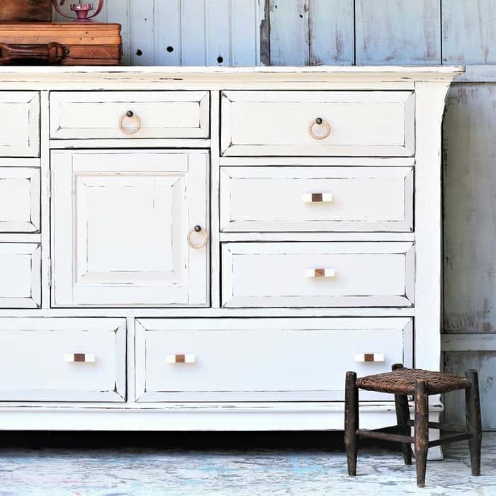
I settled on one of my favorite furniture finishes…….black paint…..distressed.

I went around in circles for this project. Privately I refer to this piece as “The Chest From He!!”. Get ready for the saga.

I bought the chest from **** at my favorite junk shop. It was only $25 and I thought the basic style was nice and I already had ideas for it. It reminds me of Waterfall furniture in a way but doesn’t have the rounded edge on the top. The chest may be from the same time period as Waterfall.

My first color choice was gray. I think the color is pretty but I wasn’t sure I liked it for this chest. I finished the makeover in gray before heading to Arkansas for a week. When I got back home I looked at the chest again and decided I didn’t like it at all. The whole problem may be the knob thing.
The original hardware was missing or broken. I didn’t have any hardware that would fit the holes for the original hardware. The drawer pulls needed to have 4”centers. Out of all of the hardware in my stash nothing worked.
I even went to Home Depot and looked at the drawer pulls. I don’t think they make 4″ center pulls any more….at least the size isn’t a common one. So I filled one hole for each pull with wood filler. Now I just needed to pick out some pretty knobs.
The knobs I selected for the gray paint were small shiny white knobs for the top drawer and big white ceramic flower knobs for the other three drawers. When I decided I didn’t like the gray paint I tried wood knobs painted gray and other knobs from my stash. None of them made me happy.

Moving on to paint color number two ( and a variant, lol). I’ve been thinking of painting something yellow and I pulled out some yellow paint. It was a bit tooooo yellow and I grabbed a lighter yellow color.

Once the chest was painted yellow……I didn’t like it either. Next I distressed the yellow and the gray paint was highlighted. I wasn’t sure about this look and I tried all kinds of knobs with the yellow/gray chest. Nothing worked. Maybe it was just me and my frame of mind. I don’t know why I had so many issues with this piece.

I went to my paint shelf again and found FolkArt Home Décor Chalk in Rich Black. Time for paint color number 3 (really number 4).
I painted the chest then distressed the paint using an electric sander. I first tried distressing by hand using 150 grit sandpaper. The yellow paint was showing where I distressed the black paint….and that didn’t look good. I pulled out the electric sander so I could take off all the layers of the paint down to bare wood in the distressed areas. When you need a lot of deep distressing a power sander is the way to go.

Sometimes I don’t wax the FolkArt Chalk but because of the heavy distressing I did. I used Howard’s Wax in Walnut. You just wipe the wax on with a lint free rag, wait for it to dry, then buff with a lint free rag. The wax leaves a really nice sheen.
Another reason for waxing is that the black chalk finish will definitely show finger smudges, etc. You know the powdery look I’m talking about. It isn’t noticeable when I use white chalk finish or other light paint colors so no waxing then. I’m not a big fan of waxing. Just extra work.

The antique glass knobs came from my hardware stash. They were the only things that looked half way okay.
update: Thanks everyone for your input on the knobs. You were right….the knobs needed to be bigger. Guess what? I went to Hobby Lobby to find knobs that might work. I found some but they were $6.99 each and they weren’t on sale. I waited until the next week and when I went in Hobby Lobby they had a bunch of knobs on clearance, marked with yellow stickers. And the ones I picked out the week before were $1.74 each. Win!
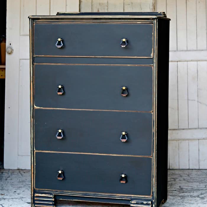
So what do you think of this look. As you can see the knobs are the drop kind (right term?). They have a bit of gold tone on them, black metal drop thing, and then a piece of leather in brown. I’m loving the new look. As always, thanks for your comments and suggestions.
Now it’s time for you to chime in. What do you think? Should I have stuck with the gray? I won’t even ask you about the yellow. Have you had problems choosing furniture paint colors or maybe wall colors? Leave me a note.
I do like gray furniture and one of my all time favorites is the gray chest my granddaughter painted. She did an awesome job. She picked out the knobs and the paint color. I wouldn’t have selected the knobs she did and you know what…..they were perfect for the chest. We have totally different taste. That’s what makes the world go round. You can see Tenley’s paint project here…..Granddaughter Paints Bedroom Furniture.
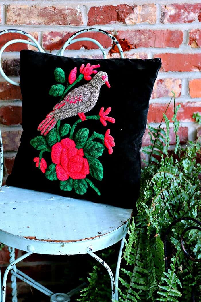
Just a side note on nothing that has to do with this project. I was visiting with my neighbor yesterday afternoon….the one who has the concrete lawn Goose I painted. She gave me the hand stitched pillow cover you see in the photo above. It was a gift from her sister several, several, years ago. I’m in love with it. Aren’t those colors gorgeous. I had a pillow form so…..perfect.
You can find my favorite DIY products on the Petticoat Junktion Amazon Page here.
Thanks for being here and have a great day, Kathy
I love the oops paint too! Our Habitat just has old out of style ugly knobs.
I really liked the final outcome with the black. I can really see that in someone’s home! I’m more of my colors person so maybe would have went with something different. I was able to get both a 5 gallon bucket of mis-mixed “blue” and a 5gal black for $5 each at Lowes so i”m always making my own colors up by adding a little of this and that. and I also get most if not all my knobs at the local Habitat for Humanity store. they have some really beautiful ones. I try to go at least once every couple of weeks to see what’s new.
I totally agree when you said that the style and color of the furniture must go well with the room’s color as well. I guess I will be needing the help of my husband for this chore since I am not the creative person in our family. We just need to have a new sofa because the room has been renovated, and the old sofa of ours does not fit in anymore.
I LOVE the final black. The only things I may change are larger knobs and if there was there a way to “save” the decorative wood strip near the top. Otherwise, it’s perfect!
I know choosing a color can be frustrating. I am going through the process of stripping my bedroom furniture and choosing the right color. Love the look of white furniture but am so afraid of knot holes showing through the paint. So they sit with bare wood because I am afraid a particular color would be a bad choice and I would have to go and strip them all over again. That is a long, time consuming project that I would not want to go repeat!!!!! Grrrrr:(
hahahahaha
Duh!! ? Thanks!
Love the distressed black. Black is my “go to color” when nothing else seems right. I do like gray but like you said, on some furniture it just doesn’t look right.
Thanks Sheila
For the marks showing I would use a dark wax which helps blend those in!
Thank you so much Janina!
Naomi, I can tell you understand my frustration since you’ve been there. I do need different knobs. It took the first reader pointing that out for me to see it. Now I just have to find the perfect knobs.
Kathy, I think the distressed black gives the dresser a very dramatic look. I didn’t like the grey and tho’t the yellow didn’t go with that style chest at all. Plus, yellow isn’t a color that you can put just anywhere, so I tho’t it probably wouldn’t appeal to as many people. The grey just looked very blah and boring to me. But the BLACK—-wow! The only thing I’m not too taken with are the knobs. I would have liked to see something a bit more unique or dramatic to complement the black. Like a little bit bigger embossed pewter-like finish. What do you think? It definitely was a challenge, wasn’t it? But you conquered it famously!
I can relate to the having to do it over theme best from back when I used to sew a lot. I did a lot of things over! And sometimes the frustration was hugh! I can remember having to just abandon the project for a while ’til I got a better idea and/or calmed down!
Anyway, you did a great job in the end with this dresser. Yessiree! I’d put it in my house!
Sometimes perfection takes extra work. The black is PERFECTION! Knobs and all. I wish l needed a dresser and you lived close by.
Love the black! Thanks for the hint on distressing when there is a color underneath you don’t want showing through. I always sand last coat with 400 grit but have issues with the marks showing on a dark color, even with 400 grit. Any suggestions?
I really like it just as it is! The gray was a little too bland. Much better in the black. Always look forward to seeing
what you come up with next.
I agree. The knobs are too small and get lost. Didn’t like gray or yellow. I sort of like the black chest but there’s something that looks unfinished about it. Hate to put a negative comment without a solution but when I first saw it, I thought that was how you bought it. As Effie said, maybe some big gold knobs would pull it together. I usually love all of your work, but this piece makes me feel unfinished…
BTW, is there such thing as a writing instrument with a marker nib but that you can refill yourself. I want to outline some letters and using a brush just doesn’t work.
I like the black over the other colors for sure, however I think the knobs should be one size larger.
Thank you Sondra. I think I have seen a similar piece to yours on Pinterest. I love that look and almost did it for this piece. Wish I had.
It might look better white but I’m done painting this piece!
I feel like the black just looks too distressed. I think I’d start all over again. Maybe white?
I have done a chest similar to this and did it in two contrasting shades of gray. I did a simple stencil to frame the handles and it turned out great…sold it right away. But…I love the black distressed version. I do believe the knobs or handles could be large but I love it! Thank you for all the pointers you give I have used many of them in my business.
Definitely black is the winner. And I agree, pulls would look much better. Your distressing on thispiece is wonderful Kathy – what a talented artist you are
I love the final outcome in your paint color, I feel the round knobs are to small for the size of the drawers. Try larger knobs or go with pulls. That is my two cents for the day. Thank you for sharing.
Love the black and agree need pulls for the drawers not knobs. But the black is great and will go anywhere with any color scheme.
Thanks for sharing! Love what you do and look forward to every story. Have a good day.
I like the high distress black look much better than the grey. But, I quite liked the yellow version. With the right hardware, it was a bold statement piece.
I liked the gray and the last black you did. I agree that the knobs need to be a little larger. I think it would really make a difference in the look of either color. I agree that the yellow just looked dirty/dingy.
I also could see this in soft beachy colors.
The black was the perfect choice. Sometimes I wax the distressed wood I’ve exposed with a dark wax to have less of a contrast, but I like the lighter wood coming through. The gray was okay, but a bit bland. Yellow usually needs a little bit of of a curvy or funky look to it so the color enhances the funkiness of the piece. But this dresser is somewhat basic so the black gives it gravitas. Like it!
I totally love this piece. I agree the knobs need to be larger. They look gold close up and they would be OK if larger but I think larger gold knobs or pulls in a brushed gold would look smashing. I would buy this piece if I visited your store but I have a piece at home just like it so I now have an inspiration to do this paint like yours. Thanks for continuing to try different paints when one doesn’t work. It just might be the inspiration I need to do what you do best and that’s paint.
The gray was just too flat and blah. I thought the yellow would work, but it just looked dirty, Black turned out attractive.
I like the distressed black. I think the knobs may be what’s holding back the love. They need to be pulls instead of knobs so they take up all that space. This dresser could be in a boys room so maybe something not too feminine or girly, but bolder. Something like these Art Deco-y that mimics the lines of the chest would be perfect. https://www.houseofantiquehardware.com/art-deco-cabinet-pulls
I liked the gray. Gray and white are my favorites right now. But you know what sells so I would trust your judgement.